 Bee Habit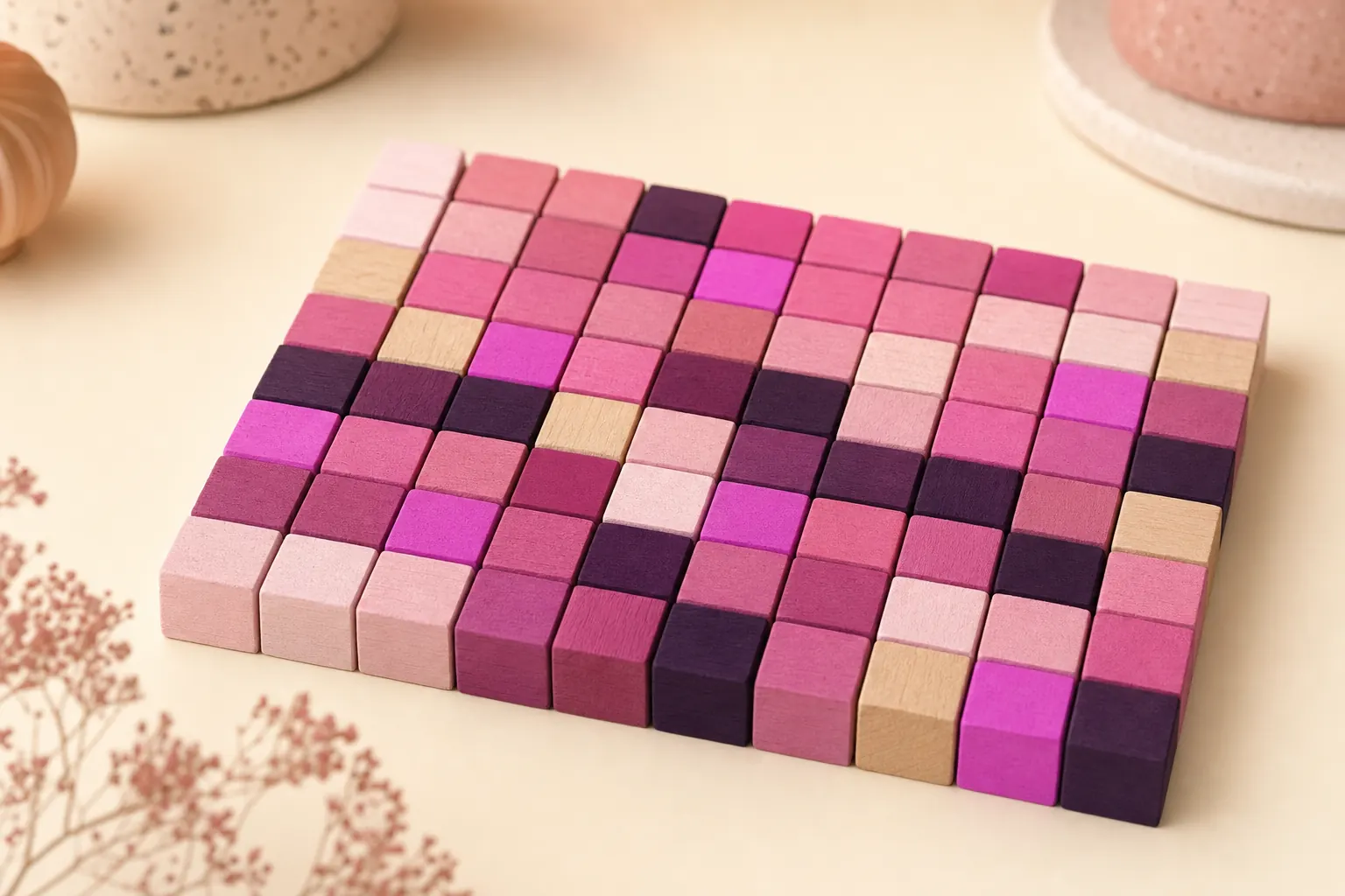
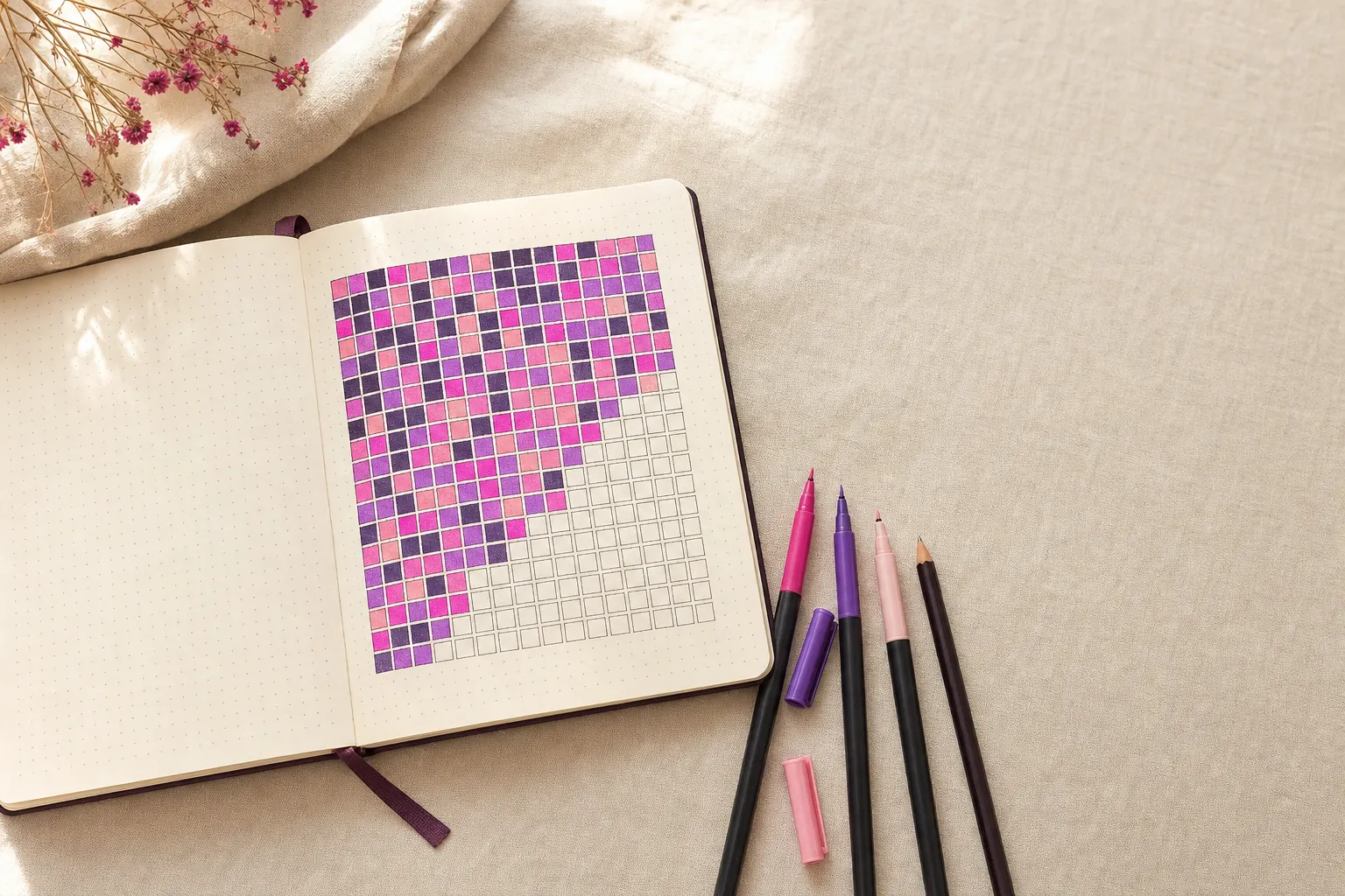
A habit heatmap is a calendar grid where each day is a colored square, darker or more filled-in when you did more. It works like GitHub's contribution graph, but for things like reading, workouts or water, and it lets you see weeks and months of consistency at a glance.
Why the GitHub contribution graph caught on
Developers have stared at GitHub's green squares for years. Each square is a day, and the color gets darker with more activity. It turned out to be motivating in a gentle way: you want the week to look full, but a single empty day hardly shows. People started copying the format for everything else, which is where habit heatmaps come from.
How to read a habit heatmap
Once you have a month or two of data, the grid starts answering questions a checklist never could:
- Weekday patterns. A column of gaps every Tuesday usually means a schedule problem, not a motivation problem.
- Momentum. Dense clusters show when a habit is carrying itself. Thinning areas are an early warning.
- Seasons. A year view shows that you walk more in spring and read more in winter, which is useful when planning.
- Recovery. After a gap, how fast do the squares fill again? Quick recovery is a sign the habit is sticking.
Heatmap vs checklist vs streak
A checklist tells you about today. A streak tells you about your current run. A heatmap tells you about all of it, and a miss is just one pale square. That is why many people who burn out on streaks do better with a heatmap. There is more on this in our guide to habit tracking without streak pressure.
A habit heatmap example
Say you track "read 20 pages" for eight weeks. Weeks one and two are almost full. Week three has three gaps, all on weekdays when you worked late. Weeks four to six fill in again, then week seven is empty except for Sunday because you were traveling. Week eight is full again.
A streak counter would have reset twice and left you with a current run of eight days. The heatmap shows something more useful: you read on 44 of 56 days, late workdays are the weak spot, and travel breaks the habit completely. Two concrete fixes follow from that. Keep a book in your work bag for late nights, and pack one for trips.
Setting up a habit heatmap
On paper, draw a grid of seven rows (one per weekday) and as many columns as weeks you want to cover, then shade a square each day. A spreadsheet with conditional formatting does the same job. Both get fiddly once you track more than two or three habits.
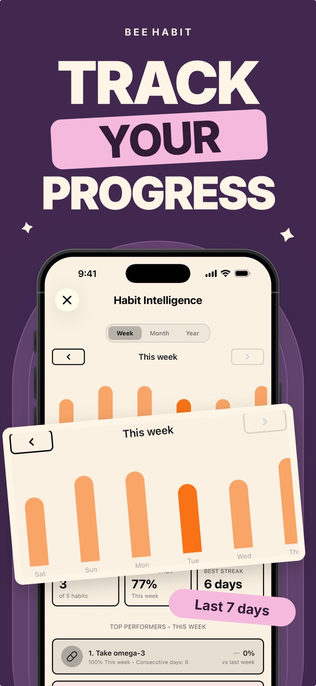
Bee Habit gives every habit its own grid on the home screen. Instead of plain shades, completed days fill with a pattern you choose, so your reading habit might become a field of pink florals and your walks a violet chevron. For the numbers behind the picture, the Habit Intelligence screen shows weekly, monthly and yearly charts, your consistency rate and which habits are ahead of last week.
Common questions
What is the difference between a habit heatmap and a year in pixels?
They are close cousins. A year in pixels usually lays out months and days in a table, while a heatmap follows the GitHub layout of weeks and weekdays. Both give each day its own square.
Can a heatmap show habits I do more than once a day?
Yes. Heatmaps often use darker shades for more activity. In an app, count or reps habits can fill a day once you reach the daily target, such as 3 sets or 8 glasses.